Brand
The logo is a full stop
Writing about Stocked, or putting us in your integrations page? Here are the marks, the two colours they come in, and the few rules that keep them looking right.
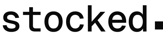


Two colours, on purpose
Everything colourful in the product means an area of the product, not the brand — so the brand keeps none of it.
Ink
#0a0a0a
The marks on light ground
Paper
#fafafa
The marks on dark ground
House rules
Always lowercase. The wordmark is a sentence, not a title.
Ink on light ground, paper on dark. Never a third colour.
The square is a full stop — don't round it, rotate it, or lift it off the baseline.
Leave one square's width of clear space on every side.